You scroll through a blog feed looking for ideas, and after a few seconds everything starts to look the same: polished stock photos, generic 3D shapes, screenshots with no personality…
For creators publishing in crowded AI, SaaS, and productivity spaces, visuals are no longer just decoration.
They help people decide whether to stop, read, and remember.
That is why ai illustration tools are becoming part of the modern content workflow. They give freelancers, marketers, and indie makers a practical way to create custom blog images and social visuals that feel specific to the message, without turning every post into a full design project.
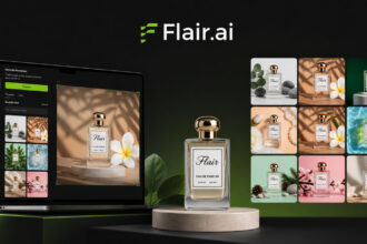
The rise of AI illustration tools for distinctive visual content
Open any busy LinkedIn feed, SaaS blog, or indie maker newsletter and you’ll notice the same problem:
the words may be different, but the visuals often feel strangely interchangeable. A laptop mockup here, a smiling person pointing at a dashboard there, maybe a vague 3D blob floating beside a headline. It works for a while. Then everything starts to blur.
That is where ai illustration tools have become genuinely useful. They let creators turn a content idea into a custom visual without waiting on a designer, searching through stock libraries, or settling for the same image already used by three competitors.
An AI illustration generator usually works from prompts, references, sketches, brand colors, or style presets. The output can be a flat editorial illustration, a playful character scene, a vector-style icon, a 3D visual, or a social post graphic. The best ai visual content tools are not just “image makers.” They act more like creative production systems.
For blogs like BoostflowAI, this fits naturally into the broader world of AI image generation for design and marketing. The real value is not making random pretty pictures. It is building visual assets that support a message, explain an idea, and make the content feel owned.
Why unique AI-generated illustrations are essential for blogs and social media
A good illustration can do something a stock photo rarely does: make an abstract idea feel concrete. This matters a lot in AI, productivity, automation, SaaS, and marketing content, where the subject is often invisible.
A workflow, a prompt system, a content pipeline, or a customer journey is hard to photograph. It is much easier to illustrate.
Generic visuals may fill a space, but they rarely add meaning
Custom illustration ai tools help you create images that match the exact angle of your article. A blog post about AI agents managing repetitive research tasks can show a small “agent” moving cards across a visual workflow. A social post about content repurposing can show one core idea branching into short videos, carousels, and email snippets. The visual becomes part of the explanation, not decoration.
There is also the brand memory side. When people see the same illustration style across your blog thumbnails, social posts, carousels, and newsletter headers, they begin to recognize your content faster. That recognition compounds, especially for freelancers and indie makers who do not have huge distribution budgets.
I’ve found that unique visuals are especially powerful when the topic sounds dry at first glance. “Workflow documentation” is not exactly thrilling. Pair it with a clean, clever illustration of messy inputs becoming organized systems, and suddenly the idea feels easier to grasp.
For social media, the effect is even more direct. Feeds move fast. AI art for blogs and social visuals can give someone a reason to pause before they read the headline. That pause is small, but in content marketing, small pauses matter.
Essential features to look for in AI illustration generators
Not every AI illustration tool is built for content creators. Some are fun for experiments but painful for repeatable work. Others are powerful but too slow when you need three blog headers and six social variants before lunch. The right tool should support both creativity and production
Style consistency
Style consistency is probably the first feature I’d check. A single impressive image is nice. A repeatable visual identity is much more useful.
For blog and social content, you want an AI illustration generator that can remember or recreate a specific look: line thickness, color palette, character shape, lighting, composition, icon style, and level of detail. Without that, your visuals may look like they came from five different brands.
This is why tools focused on consistent illustration systems can be valuable. For example, if your content strategy relies heavily on icons, characters, or recurring visual metaphors, it is worth looking at workflows like creating consistent AI illustrations and icons with Recraft. Consistency saves editing time and keeps your brand from feeling visually scattered.
Customization and control
The best ai illustration tools give you room to direct the image, not just hope the model understands you. Useful controls include aspect ratio, style reference, color palette, background complexity, object placement, image-to-image editing, and export format.
Here is a simple comparison of features that matter in daily content work:
| Feature | Why it matters | Best for |
|---|---|---|
| Style reference | Keeps visuals consistent | Brand systems |
| Vector export | Makes editing easier | Icons and diagrams |
| Aspect ratios | Fits each platform | Social posts |
| Image editing | Fixes weak outputs | Fast iteration |
| Commercial rights | Reduces usage risk | Client work |
Output quality also matters, but not in the vague “high resolution” sense. Look closely at hands, text, object logic, spacing, and visual hierarchy.
Some tools can create beautiful images that fall apart when used as a blog thumbnail because the composition is too busy or the subject is unclear at small sizes
Ease of use is another underrated feature. A tool that requires twenty prompt tweaks for every acceptable result may still be powerful, but it will not fit well into a fast publishing workflow. For marketers and SaaS builders, speed matters because visuals are usually one part of a bigger system.
Integration can be a quiet productivity win. Exporting directly to Figma, Canva, Adobe tools, or social templates reduces friction. Even a simple transparent PNG export can make a difference when you are building carousels or overlaying illustrations on branded backgrounds.
One more thing: check whether the tool is better at illustration or stock-style realism. Some platforms lean toward polished marketing visuals, which can be useful when you need faster stock-like assets. In that case, a workflow such as using Freepik AI for stock-style visuals may fit better than a pure illustration tool.
Crafting custom illustrations with AI: a practical workflow for content creators
The mistake I see often is treating AI image generation like a slot machine. Type a vague prompt, generate four options, dislike them, repeat. That can work for inspiration, but it is not a workflow.
A better approach starts with the job of the image. Before opening the tool, decide whether the visual needs to explain, attract, summarize, decorate, or differentiate. Those are different tasks. A hero image for a blog post needs clarity and brand fit. A social graphic may need stronger contrast and a simpler idea. A newsletter illustration can be softer and more atmospheric.
Start with the content angle
Pull the central idea from the article first. Not the title, the idea. For example, an article about “AI visual content tools” might actually be about saving time, avoiding generic stock images, or creating a consistent brand system without hiring a full design team.
Once the angle is clear, translate it into a visual metaphor. A few reliable patterns work well:
- Turn workflows into paths, boards, pipelines, or connected blocks.
- Turn productivity ideas into desks, dashboards, checklists, or assistants.
- Turn strategy concepts into maps, layers, bridges, or control panels.
- Turn content systems into branching trees, machines, or modular kits.
Now the prompt has a direction.
Generate, critique, and refine
The first output should not be treated as final. I usually judge it in three passes. First, does the concept make sense? Second, does it match the brand style? Third, will it work in the final format?
That last question catches many problems. A detailed illustration may look great at full size but become visual soup inside a 1200 x 630 blog card. A social post image might need one strong subject, not five clever details. Small screens are ruthless.
Refinement prompts should be specific. Instead of “make it better,” ask for fewer objects, more negative space, a flatter style, stronger subject focus, or a calmer background. With ai blog images, clarity usually beats complexity.
After that, adapt the image for each channel. A blog header, X post, LinkedIn carousel cover, Pinterest pin, and newsletter banner should not always use the exact same crop. Keep the core visual consistent, then adjust framing and density.
Best practices for integrating AI blog images and social visuals
AI-generated visuals work best when they are part of a system, not random one-off experiments. The system does not need to be complicated. A simple visual guideline can save you from the “everything looks cool but nothing matches” problem.
Choose a limited style direction and stick with it for a content cluster. Maybe your blog uses flat editorial scenes with soft shadows. Maybe your social posts use bold vector icons and minimal backgrounds. Pick something that supports the brand personality, then repeat it enough for people to recognize it.
File management matters more than it sounds. Keep prompts, final images, source files, and usage notes together. When a visual performs well, you want to know how it was made. No biggie in week one. Very annoying after publishing fifty assets.
Platform optimization should also shape the image before it goes live. Blog images need to load quickly and support the article. Social visuals need contrast, readable spacing, and a clear focal point. Open graph images need to survive awkward crops. Mobile previews should always be checked.
A few practical habits make ai visual content tools easier to use responsibly:
- Use AI illustrations to support the message, not distract from weak content.
- Avoid copying a living artist’s exact style or recognizable brand identity.
- Check commercial usage terms before using visuals for client or paid campaigns.
- Edit outputs when needed instead of publishing obvious AI artifacts.
- Keep a repeatable prompt library for your main content formats.
There is a useful balance here. AI illustration tools can make visual production faster, cheaper, and more flexible, but the creative direction still needs a human eye. The tool can generate the image. It cannot decide what your audience should feel, understand, or remember.
That part is still on us
AI illustration tools are not a replacement for taste, strategy, or brand thinking.
They are more like a faster visual workshop: useful when you know what you want to communicate, risky when you only ask them to “make something nice.”
For blogs and social content, the real advantage is consistency with flexibility.
You can build visuals that explain ideas, support your positioning, and feel recognizable across channels without slowing down every publishing cycle. And honestly, that is where AI starts to feel less like a gimmick and more like a practical creative system.

Artificial Intelligence Specialist | AI-Driven Workflow Strategist