I opened the same prompt three times and still got three visuals that looked like they came from different brands. One had soft pastel shapes, another leaned into glossy 3D, and the third somehow felt like a fintech mascot from 2018.
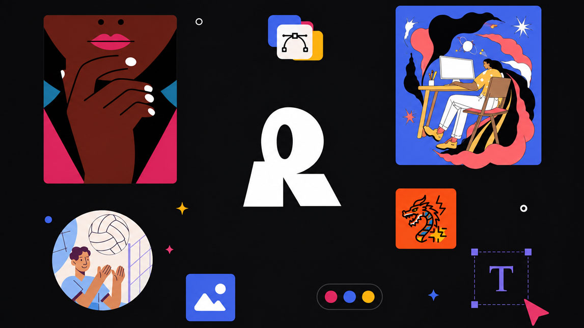
That is the real challenge with AI visuals: getting one good image is easy, but building a consistent system is harder. Recraft helps solve that gap by giving freelancers, marketers, and SaaS teams a more controlled way to create illustrations and icons that actually feel connected.
How Recraft AI design solves consistency issues
Most AI image tools are great at producing one good visual. The problem starts when you need the next five to look like they belong to the same brand. That is where recraft ai design feels more useful than a general image generator.
Recraft gives you more control over visual direction, especially when you are working with palettes, styles, and reusable looks. Instead of prompting from scratch every time, you can build around a defined aesthetic and keep assets aligned across blog graphics, landing pages, and social posts.
The vector output is a big part of the appeal. For marketers and SaaS builders, this means an illustration or icon can move from a hero section to a pitch deck without turning blurry or needing a full redesign.
| Need | Recraft use |
|---|---|
| Style consistency | Reusable visual direction |
| Brand colors | Palette control |
| Scalable graphics | Vector export |
For a broader comparison, it fits naturally beside other AI tools for original blog and social visuals, but its strongest angle is consistency.
Creating cohesive AI illustrations with Recraft
Start with one visual language
I would not start by generating ten different ideas. That usually creates a messy folder of “almost right” images. A better workflow is to define the illustration style first: flat, 3D, minimal, hand-drawn, editorial, geometric, or whatever matches your brand.
Once that direction is clear, Recraft becomes easier to guide. You can create a first illustration, refine it, then use that as the base reference for the rest of the set. This makes it much more practical as an ai illustration tool, especially for content teams that need visuals every week.
A simple workflow looks like this:
- Define the style and color palette before generating.
- Create one strong reference illustration.
- Reuse the same direction for related assets.
- Adjust details without changing the whole visual identity.
The result feels less random. That matters when your blog thumbnails, onboarding screens, and social graphics all need to look like they came from the same system, not five different freelancers.
Use it for repeatable content assets
For BoostflowAI-style workflows, I’d use Recraft for recurring visuals: automation diagrams, feature illustrations, newsletter graphics, and lightweight SaaS explainers.
Generating consistent AI icons for your brand
Icons are where inconsistency becomes painfully obvious. One icon has rounded edges, another looks sharp, a third uses a slightly different shade of blue, and suddenly the interface feels patched together
Recraft works well as an ai icon generator because it lets you push toward a shared structure. You can keep line weight, shape language, color usage, and proportions closer across a full set. That is useful for SaaS feature pages, pricing sections, dashboards, help centers, and product comparison blocks
Keep the icon system tight
The trick is to treat icons as a system, not individual images. Decide whether they should be filled, outlined, duotone, rounded, minimal, or playful before you generate the set.
Vector export also helps here. A vector ai generator gives you assets that can be resized, recolored, and adapted without losing clarity. For small teams, that saves a surprising amount of cleanup time.
You can explore the tool directly through Recraft AI design when you need a more controlled workflow for brand assets.
Beyond individual assets: Recraft for brand cohesion
The bigger value of Recraft is not only making “nice images.” It helps build a visual language that can repeat across channels.
That is why I see it as a practical brand illustration ai tool rather than just another image generator. A freelancer can use it to make a client’s blog graphics feel unified. A marketer can create campaign visuals without rebuilding the art direction each time. A SaaS founder can produce icons and illustrations that support the product story without hiring a full design team for every small update.
Used well, Recraft becomes part of the brand system. Not magic. Not a replacement for taste. But definitely a cleaner way to turn visual ideas into consistent, usable assets.
Recraft’s biggest advantage is that it makes AI visuals feel less scattered. When your illustrations and icons share the same style, palette, and format, your brand instantly looks more intentional.
For small teams, that can be the difference between “we generated some images” and “we built a visual system we can actually reuse.”
FAQ
What is Recraft and how does it help with AI design?
Recraft is an AI design platform that empowers users to generate consistent illustrations, icons, and vector graphics. It streamlines the creation process, ensuring brand style coherence across all visual assets
How does Recraft ensure consistency in AI illustrations?
Recraft achieves consistency by allowing users to define a specific style, color palette, and aesthetic. Once set, the AI adheres to these parameters for all subsequent generations, maintaining a unified visual identity.
Can Recraft generate vector AI graphics?
Yes, Recraft is a powerful vector AI generator. It can produce scalable vector illustrations and icons, making them ideal for various applications from web design to print without losing quality.
Is Recraft suitable for creating brand illustrations and icons?
Absolutely. Recraft excels at creating brand-specific illustrations and icons. Its ability to maintain a consistent style and color scheme makes it an invaluable tool for developing cohesive brand visuals.
What makes Recraft different from other AI illustration tools?
Recraft stands out due to its strong focus on consistency and vector output. Unlike many tools that generate disparate images, Recraft allows designers to build a unified visual language for their projects.

Artificial Intelligence Specialist | AI-Driven Workflow Strategist