I used to treat affiliate blog visuals as the “quick design task” at the end of an article. Then I’d spend 40 minutes resizing a featured image, testing three layouts, and wondering why every product roundup looked slightly disconnected from the last one.
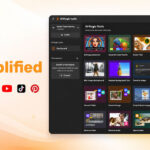
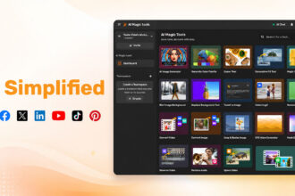
That is exactly where an ai blog image workflow becomes useful. Instead of creating visuals from scratch every time, you build a repeatable system for featured images, in-content graphics, product visuals, and brand consistency, without turning your content process into a design bottleneck.
The power of AI in affiliate blog visuals and featured images
A featured image is often the first visual promise your affiliate article makes. Before someone reads your comparison, review, tutorial, or product breakdown, they see a thumbnail in search, social feeds, newsletters, or related posts. If that image feels generic, the article already starts with a small trust problem.
That is where an ai blog image workflow becomes genuinely useful. Not because AI replaces design taste, but because it removes the slowest part of the process: staring at a blank canvas and trying to invent a direction from scratch.
For affiliate blogs, this matters. You are usually producing content across product categories, buyer intents, and seasonal campaigns.
AI can help you create ai blog visuals faster while keeping a consistent look across the site. The real win is not just speed. It is repeatability.
A good workflow moves from keyword and article angle to visual concept, featured image, in-content graphic, optimization, and publishing without rebuilding the process every time. That connects directly to the bigger idea behind building faster AI design workflows for content production, where design becomes part of the content system instead of a last-minute task.
Deconstructing the AI blog image workflow for affiliates
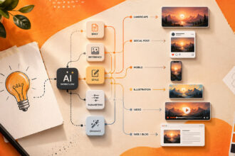
A practical ai blog image workflow starts before you open an ai featured image generator. I usually begin with the article’s promise: is this post helping readers compare tools, choose a product, understand a process, or solve a small annoying problem? The visual should support that promise, not decorate it randomly.
Start with the article angle
For an affiliate review, the featured image might show a clean product setup, a dashboard-style scene, or a “before and after” productivity contrast. For a comparison post, a split-screen concept often works better. For a tutorial, I prefer visuals that suggest movement: steps, layers, screens, arrows, or modular blocks.
The workflow can stay simple:
- Define the article intent and reader problem.
- Choose the main visual metaphor.
- Generate three to five image concepts.
- Select the strongest direction before polishing.
- Resize, compress, rename, and upload the final asset.
The prompt should include content context, audience, format, style, and brand constraints. Vague prompts produce vague visuals. Painfully predictable, but still true.
Once the image exists, I do not treat it as final. I check whether it fits the article, matches the product category, and would make sense beside other posts on the blog homepage. That last question catches weak designs fast.
Top AI featured image generators for affiliate content
The best ai featured image generator depends on how much control you need. Some tools are excellent for creative concepts. Others are better when you need fast branded graphics, template consistency, or easy resizing for WordPress and social platforms.
For affiliate content, I would not pick a tool based only on image quality. I would look at workflow friction. Can you create variations quickly? Can you keep style consiistent? Can you adjust the image without starting over?
Here is a simple way to think about tool choice:
| Tool type | Best use | Watch out for |
|---|---|---|
| Image generators | Unique concepts | Brand consistency |
| AI design platforms | Fast templates | Generic layouts |
| Infographic tools | Data visuals | Overloaded graphics |
Midjourney-style tools can be strong for striking featured images, especially if your affiliate blog has a more editorial look. DALL-E-style tools are useful when you need flexible concepts and quick iterations. Canva-style AI design tools work well when you want speed, text overlays, brand kits, and repeatable templates in one place.
For SaaS affiliate content, a clean abstract interface visual often performs better than a literal laptop-with-icons image. For physical products, lifestyle-inspired scenes can help readers imagine the use case without pretending to show the exact product. If the image implies a feature that does not exist, you are creating confusion, not conversion.
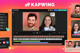
I also like separating the “concept generator” from the “layout finisher.” Generate the core image in one tool, then finish the layout in your preferred affiliate blog design tools.
Add spacing, crop for the theme, apply brand colors, and create reusable templates for future posts.
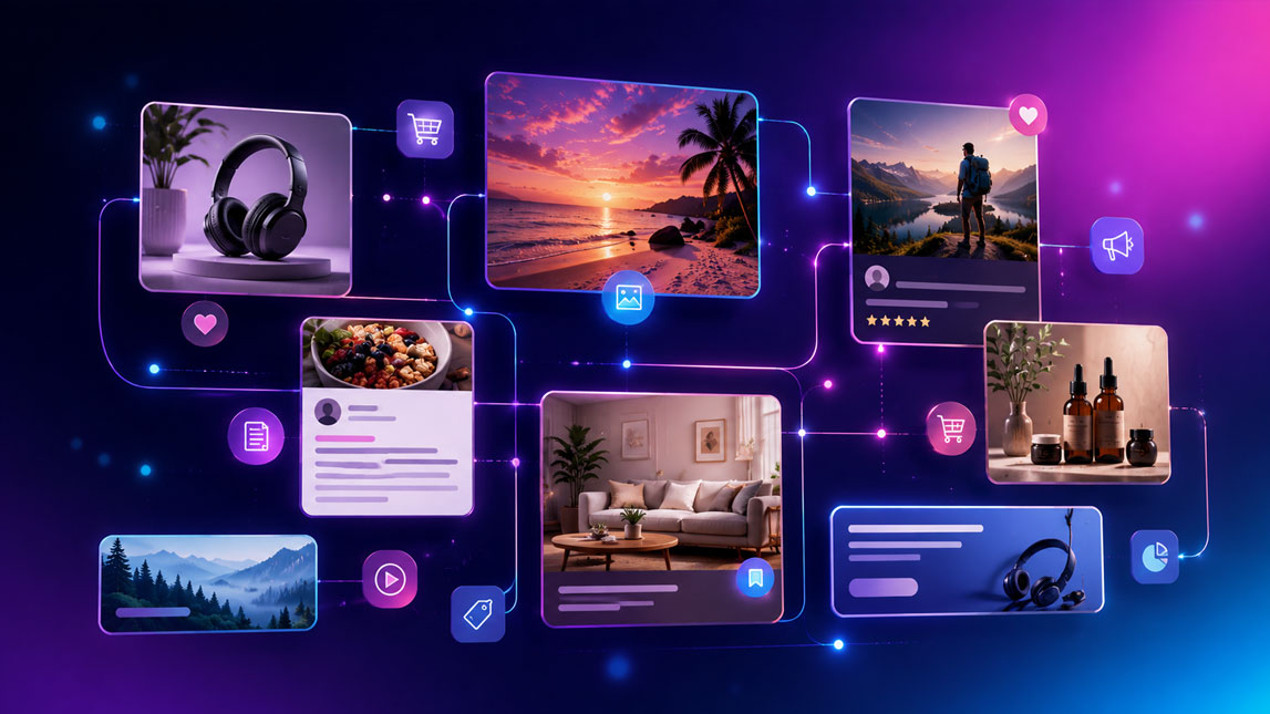
Crafting engaging AI blog visuals for content sections
Featured images get attention, but in-content visuals keep people moving. This is especially important in affiliate posts where readers skim, compare, hesitate, and return to specific sections before clicking.
Use visuals to reduce decision fatigue
The strongest ai content visuals usually explain something the paragraph cannot explain quickly. A product showcase can summarize who a tool is for. A comparison chart can make trade-offs easier to understand. A simple process graphic can turn a messy workflow into something the reader can follow without rereading three times.
For affiliate blogs, I would focus on visuals that support decisions:
- Product fit graphics that show the best use case for each tool.
- Mini comparison visuals that highlight pricing, difficulty, or speed.
- Workflow diagrams that show how a product fits into a broader system.
- Checklist graphics that help readers evaluate before buying.
Not every section needs an image. Too many visuals can make an article feel noisy, especially when they all compete for attention. The better approach is to add visuals where the reader might slow down, get confused, or need reassurance.
If your article compares AI design platforms, a small decision graphic can show which tool fits which user: marketers, bloggers, agencies, or SaaS teams. If your article explains infographic creation, you can point readers toward deeper tool-specific guides like creating blog infographics with Piktochart AI or using Venngage for AI-assisted reports and infographics without turning the current article into a full tool review.
Match the visual to the section job
A product showcase should feel clean and specific. A process diagram should feel simple. A comparison visual should avoid cleverness and prioritize clarity. AI makes it easy to create something impressive that does not actually help the reader.
For a “best tools” section, use consistent card-style visuals. For a “how it works” section, use numbered flows or modular blocks. For a “mistakes to avoid” section, use simple contrast graphics. The format should match the reader’s mental task.
Blog graphic design AI becomes more valuable when you build small reusable patterns. Maybe every review uses a product-fit card.
Every comparison post gets a scoring visual. Every tutorial includes one workflow diagram. Over time, the blog starts to feel designed, not patched together.
Optimizing AI-generated images for affiliate marketing success
An image is not finished when it looks good. For affiliate content, the boring optimization steps are often what make the asset usable at scale.
Start with size. A featured image should fit your theme’s recommended dimensions, display well on mobile, and avoid slowing down the page. I prefer exporting a high-quality version first, then compressing it before upload. Giant image files are one of those tiny problems that quietly damage user experience.
File names and alt text also matter. Use descriptive names that reflect the article topic, not random AI export names. Alt text should explain the image naturally, especially when the visual adds context. Do not stuff the primary keyword into every image. It looks forced, and frankly, it reads badly.
Brand consistency deserves its own check. Keep your color palette, image style, spacing, and overlays recognizable. A reader should be able to move from one affiliate post to another without feeling like they landed on a different site.
Legal and ethical details matter too. Avoid generating visuals that imitate specific brands, logos, influencers, or copyrighted product photos unless you have permission. When showing affiliate products, be careful not to misrepresent packaging, features, screenshots, or results. Trust is the asset you are really monetizing.
Integrating and future-proofing your AI content visuals strategy
The easiest way to make AI visuals sustainable is to plug them into the tools you already use. Keep a shared prompt library, a folder for approved image styles, and templates inside your design tool or CMS workflow. That small setup prevents every article from becoming a fresh design experiment.
I would also document what works. Track which featured image styles get better clicks from social, which in-content visuals improve scroll depth, and which formats make affiliate comparisons easier to read. You do not need a huge analytics operation. A simple note beside each post can reveal patterns after a few weeks.
AI content visuals will keep changing. Generators will get better at layout, text, editing, and brand memory. Still, the durable skill is not tool-hopping. It is knowing what visual the reader needs at each moment in the article, then using AI to create it faster, cleaner, and with less creative friction.
A strong AI visual workflow is not about making every affiliate article look more “designed” for the sake of it. It is about removing friction, giving readers clearer visual cues, and keeping your blog consistent as your content library grows.
The tools will keep changing, but the useful habit stays the same: decide what the reader needs to understand faster, then use AI to create visuals that support that moment.
That is where featured images and blog graphics stop feeling like decoration and start becoming part of the affiliate content strategy…

Artificial Intelligence Specialist | AI-Driven Workflow Strategist