I usually notice the need for a tool like Venngage when an article is already solid, but the visuals still feel like an afterthought. The data is there, the structure makes sense, yet the page needs something sharper than a stock image or a basic screenshot.
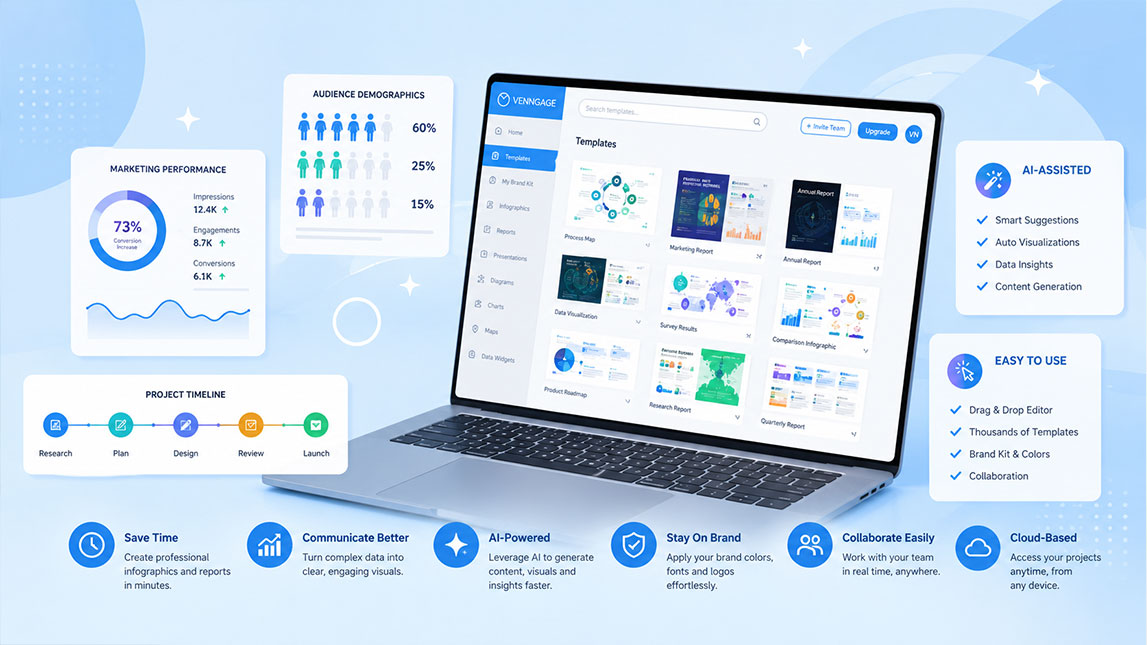
That is where a venngage ai infographic workflow can help. For freelancers, marketers, and small SaaS teams, it offers a faster way to turn article ideas, reports, and campaign insights into visuals that look intentional without opening a complex design app.
Harnessing AI for infographics and reports
Venngage sits between full design software and quick AI content tools. It helps turn rough ideas, data points, or article notes into visuals that feel polished enough for a blog, client report, or marketing asset.
That matters because content teams are not just writing anymore. They are packaging ideas. A clear chart, comparison graphic, or visual summary can make an affiliate article easier to scan, especially when it supports a broader system for creating affiliate blog visuals faster.
Venngage AI infographic creation explained
A good venngage ai infographic workflow starts with the message, not the template. I would begin with the article angle, the data, and the one takeaway the reader should remember.
From idea to visual structure
Venngage can suggest infographic layouts, visual sections, icons, and formats based on the content you want to create. That makes it useful when you have the information, but not the design instinct to structure it cleanly.
The practical flow is simple:
- Paste or summarize the core idea behind the visual.
- Choose a template direction that matches the content type.
- Adjust charts, icons, colors, and section hierarchy.
- Export the final graphic for the blog, newsletter, or report.
Used this way, Venngage’s AI infographic maker feels less like a magic button and more like a design assistant that gets the first draft moving.
Simplifying report design with AI
Reports are where Venngage becomes especially practical. A plain document can bury useful insightss, while a visual report makes the same information easier to read and act on.
Better layouts for dense information
For ai report design, the value is structure. Venngage can help shape summaries, metrics, comparisons, timelines, and recommendations into a cleaner visual sequence.
Here is where it fits best:
| Content type | Venngage use | Best output |
|---|---|---|
| Blog data | Visual summary | Infographic |
| Client results | Structured layout | Report |
| Process steps | Flow design | Workflow graphic |
The AI assistance will not replace your judgment. You still need to decide what matters, remove weak points, and check that the data is not misleading.
Key benefits for content design
The biggest advantage is speed, but not in the lazy sense. Venngage helps you move faster because it gives you a visual starting point that already looks coherent.
As an infographic maker ai, it can suggest layouts and visual patterns that would take longer to build manually. As a blog visual tool, it helps create supporting graphics that make articles feel more complete.
The main benefits are practical:
- It shortens the gap between written content and visual content.
- It improves consistency across blog graphics, reports, and social assets.
- It makes design more accessible for marketers, freelancers, and small teams.
- It helps repurpose research into multiple visual formats.
I would still review every output carefully. AI can make something look professional before the logic is actually strong, which is a sneaky little trap.
Integrating Venngage into your workflow
The smartest way to use Venngage is not as a separate design task at the end. Build it into your content process earlier.
When planning an article, mark sections that could become visuals: statistics, comparisons, workflows, pros and cons, or step-by-step explanations. Then use Venngage after the draft is stable, so the visual supports the article instead of becoming decorative fluff.
For a more scalable system, connect this tool-level workflow with AI design workflows for faster content production. That helps Venngage play one focused role inside a larger process: turning content ideas into visual assets without dragging you into a full design sprint.
In practice, I would use it for featured-image concepts, in-post infographics, mini reports, and affiliate blog visuals where clarity can improve reader confidence.
Venngage is not the kind of tool that replaces content strategy, and that is probably a good thing.
Its real value is more practical: it helps turn useful ideas into clearer visuals, faster, especially when you need infographics, reports, or blog assets that look polished without slowing down production.
For small teams and solo creators, that can make visual content feel less like a separate design project and more like a natural part of the publishing workflow.

Artificial Intelligence Specialist | AI-Driven Workflow Strategist